When someone lands on your WordPress site to pay, whether for a product, service, donation, or subscription, the payment button is far more than just a “click here to pay” trigger. It is a crucial conversion point. A well-designed WordPress payment button & the right payment system builds trust, aligns with your brand, reduces friction and ultimately encourages users to complete the payment process.
With that said, a clunky, generic or inconsistent button can feel suspicious or confusing, increasing drop‑off at the final step. With WordPress powering a large share of websites, designing payment buttons thoughtfully is more important than ever.
Why Designing a Payment Button in WordPress is Important?
Designing an effective payment button in WordPress is crucial for a number of reasons, especially in 2026, as online transactions continue to be a key element of eCommerce. Here is why it is important:
- Enhances UX: Makes payments easy and quick.
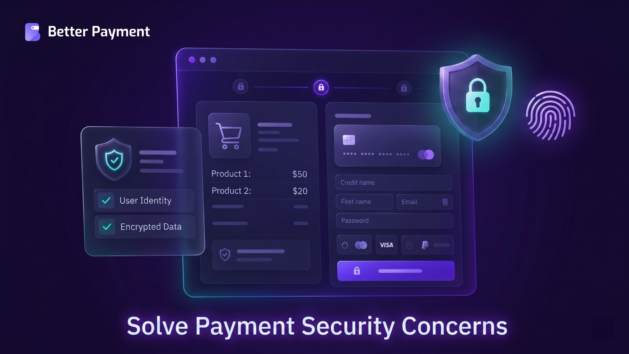
- Builds Trust: Shows security, reassuring customers.
- Boosts Conversions: A clear button increases sales.
- Maintains Branding: Matches your site’s look and feel.
- Optimizes for Mobile: Works seamlessly on all devices.
- Supports Multiple Payments: Offers more choices for users.
- Reduces Friction: Simple design leads to faster checkouts.
- Allows Customization: Tailor to your specific business needs.
- Ensures Legal Compliance: Keeps your site secure and trustworthy.
- Improves Results: A/B testing helps refine and increase conversions.
However, the design of a payment button is a critical part of the eCommerce experience. By paying attention to its aesthetics, placement, usability, and security, you can ensure a smooth transaction experience for your customers. It ultimately leads to increased sales and customer loyalty.
How to Design a WordPress Payment Button Within 1 Click: Step-by-Step
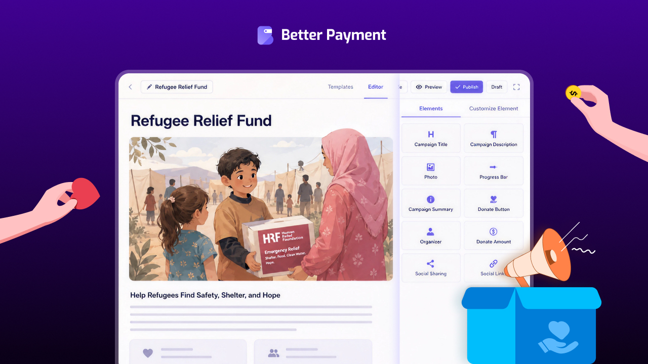
To design a WordPress button, you may consider trying Better Payment. The solution lets you add a payment button that works with major gateways (like Stripe, PayPal, Paystack) so customers can pay instantly. It integrates smoothly with your site & works with standard WordPress themes, and also with page‑builders like Elementor.
Let us follow the step-by-step guide below to design a stunning WordPress payment button.
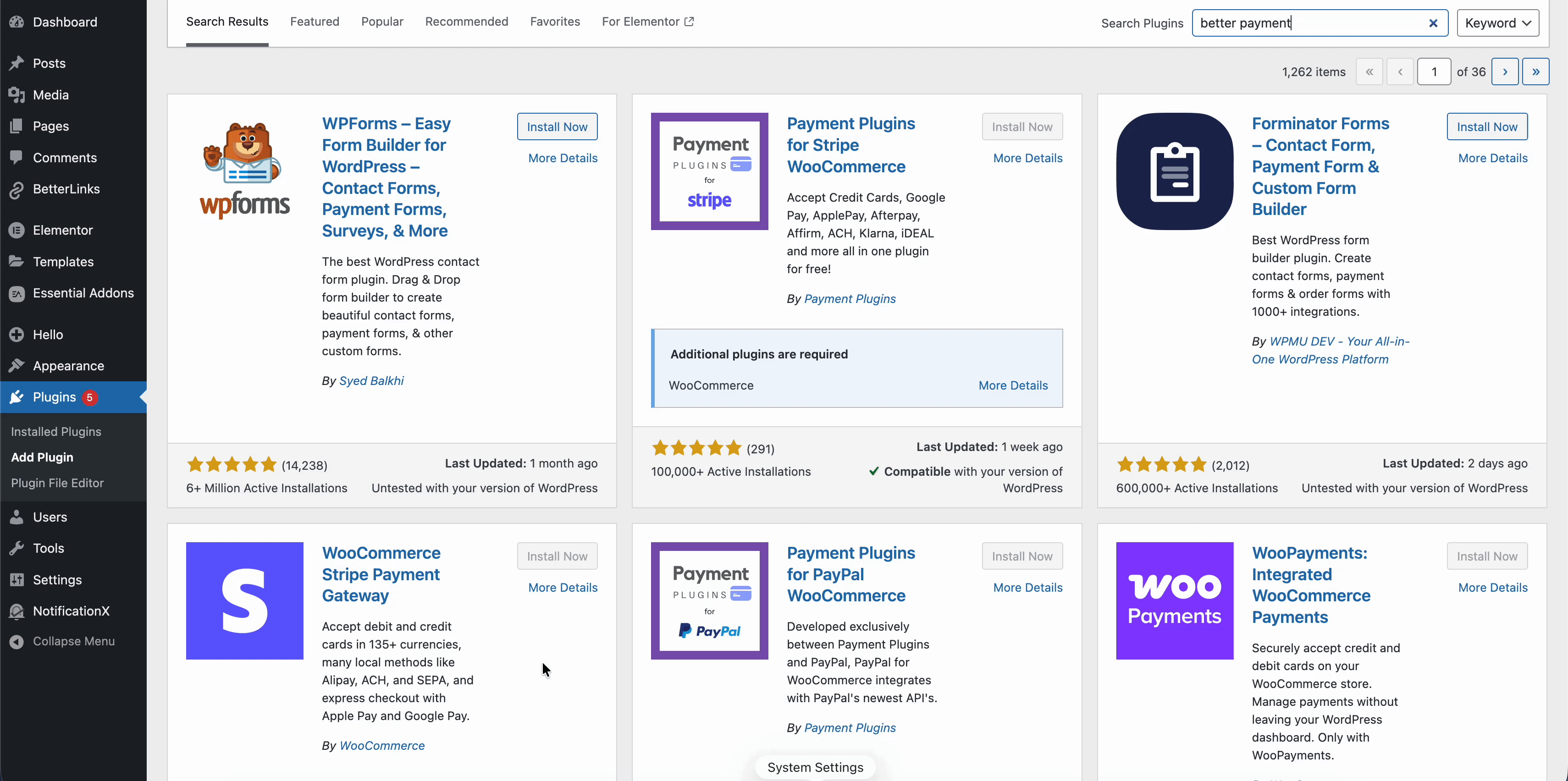
Step 1: Install & Activate Better Payment
To get started, go to your WordPress dashboard, then navigate to ‘Plugins’ and select ‘Add Plugin.’ In the search bar, type ‘Better Payment,’ and once it appears, click ‘Install’ and then ‘Activate’ the plugin.
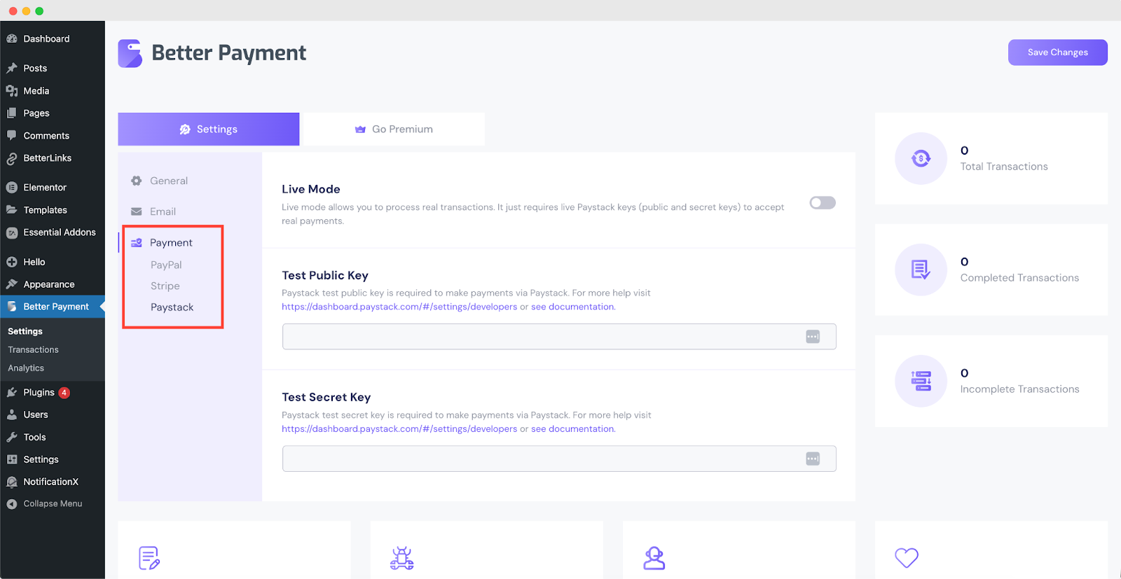
Step 2. Connect Your Payment Gateway
In the Better Payment settings, you need to enter your Stripe, PayPal or Paystack credentials, which can include your API keys or business email. Once these details are entered, make sure to enable the live mode to start accepting real payments.
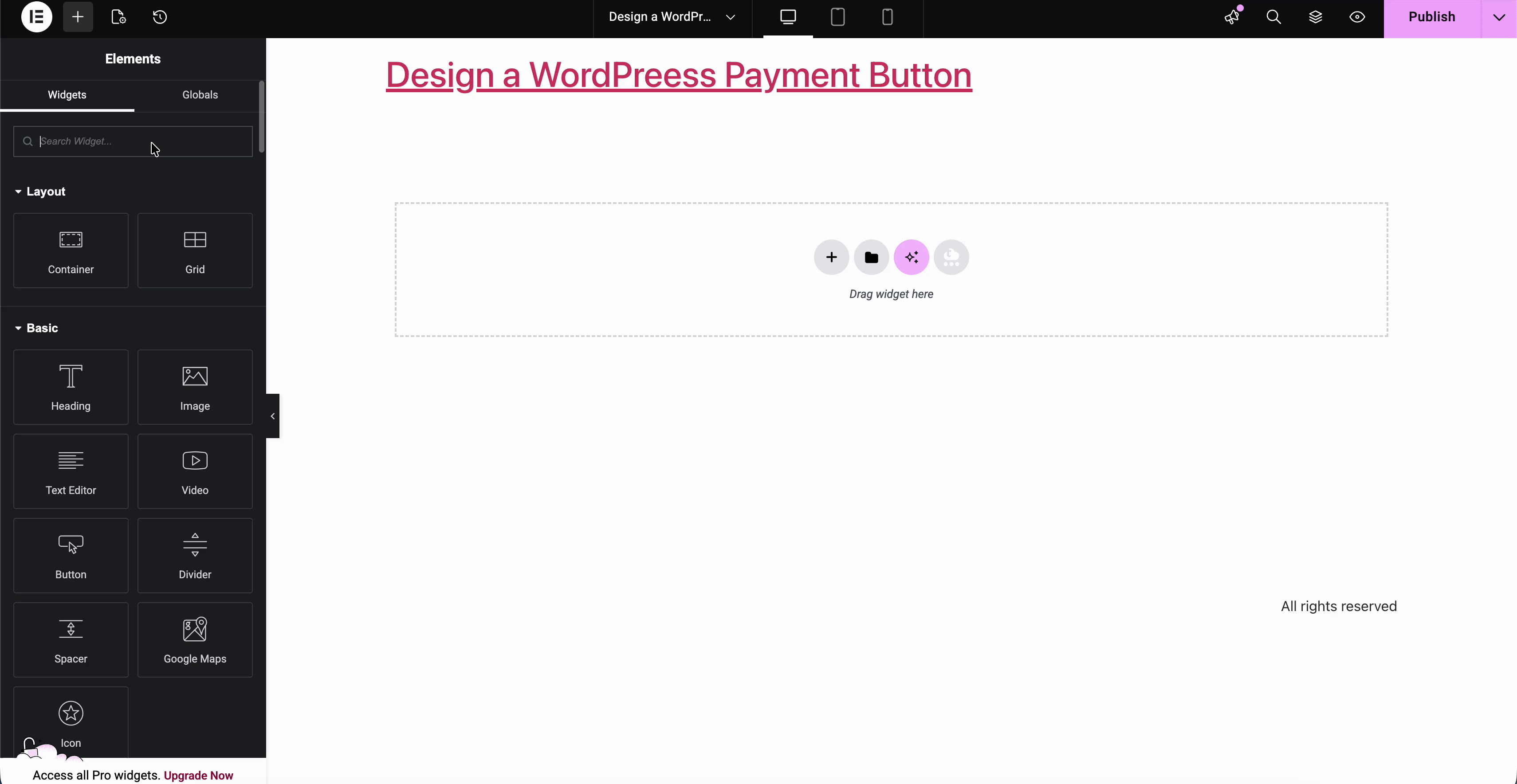
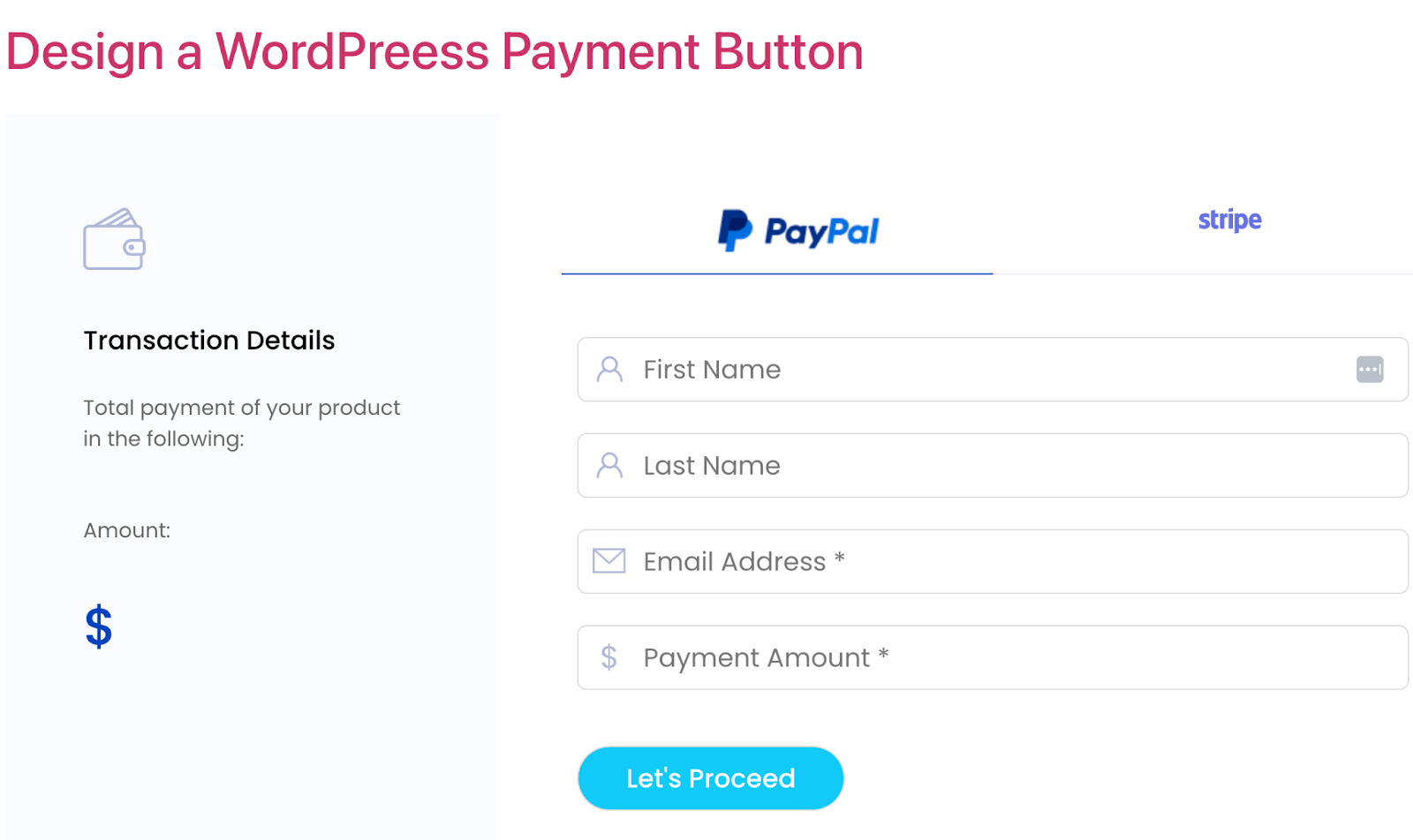
Step 3. Add the Payment Button to Your Page
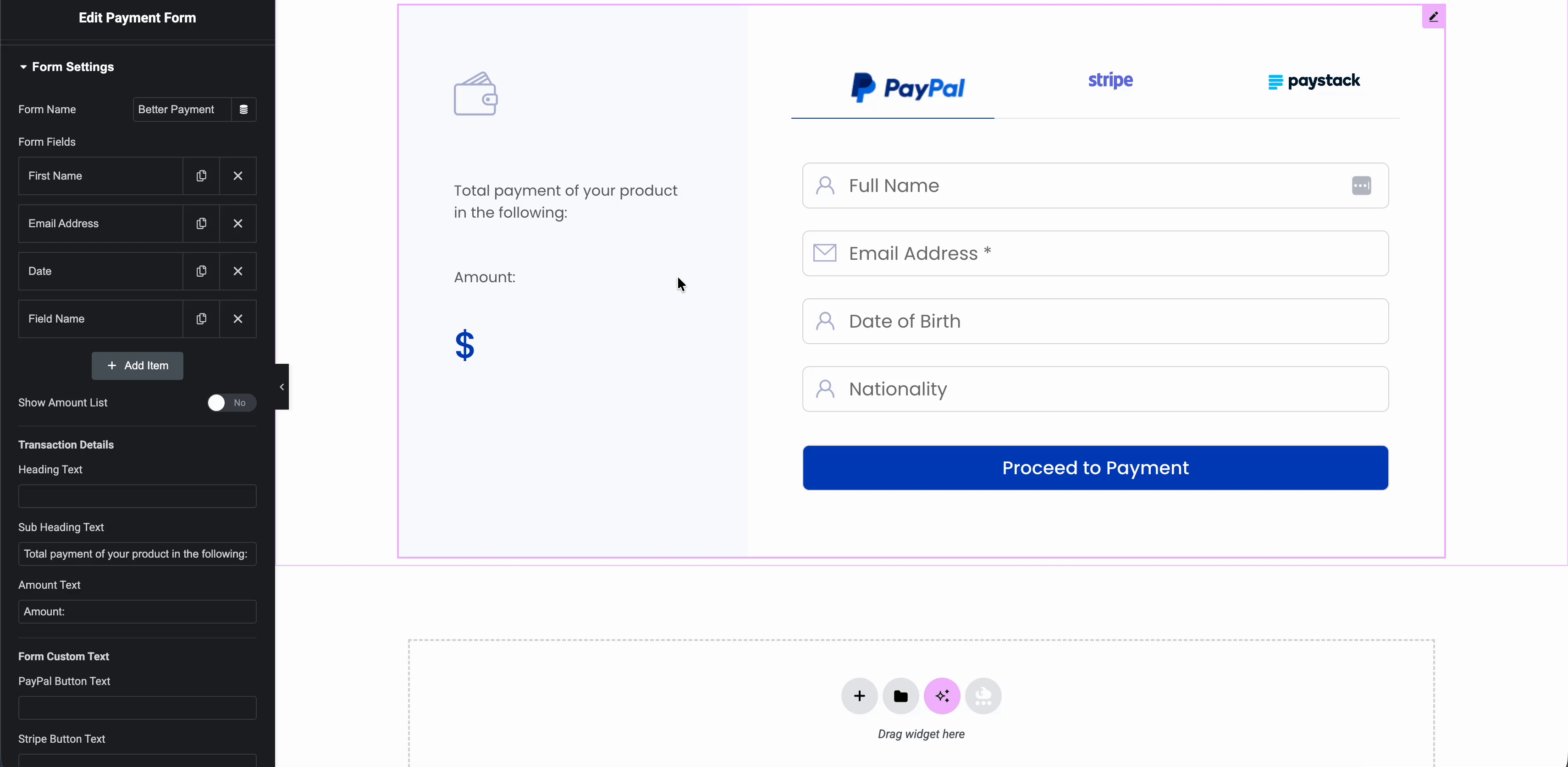
To set up the payment button using Elementor, first open the page and click “Edit with Elementor.” Drag and drop the ‘Payment Form’ widget where you want the button to appear.
Then, customize the basic settings, such as the amount, currency, and type of payment (whether it is a one-time transaction, subscription, donation, or product purchase) to fit your needs.
Step 4: Customize Button Appearance
Better Payment lets you adjust style/layout so the button fits your site design (colors, size, typography, spacing, margin, padding & more).
Step 5: Publish and Test
Once you have configured the payment button and finalized all settings, it is time to publish your page. After publishing, it is essential to test the button to ensure everything works as expected.
Start by performing a test transaction; many payment gateways, like Stripe, PayPal or Paystack, offer a sandbox or test mode, allowing you to simulate a payment without processing real money.
Things You Need to Follow While Designing a WordPress Payment Button
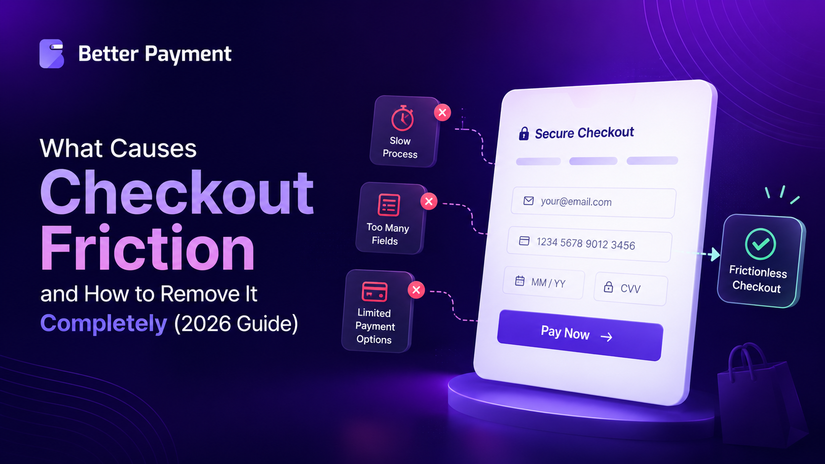
When creating a WordPress payment button, it is essential to prioritize simplicity, clarity, and security to make the payment process as seamless as possible. A well-designed button can significantly improve user trust and drive conversions.
Use Clear, Action‑Oriented Labels
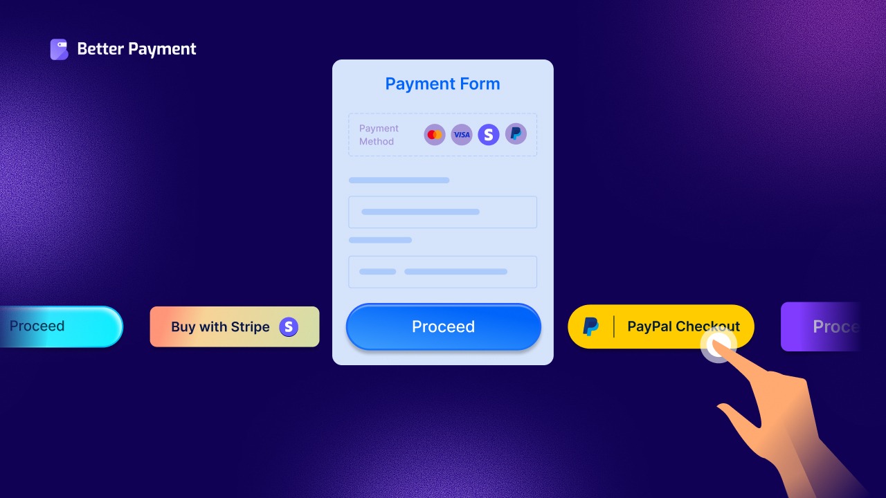
One of the simplest but most effective design decisions: make the button text explicit. Rather than “Submit” or “Continue”, use direct and user‑friendly labels like “Pay Now”, “Buy Now”, “Subscribe”, or “Donate”. This informs users exactly what will happen when they click.
For example:
- For a one‑time purchase → “Buy Now”
- For recurring subscriptions → “Subscribe”
- For donations → “Donate” or “Support Us”
Remember one thing: clear labeling reduces ambiguity and encourages trust during the payment process.
Match the Button Style With Your Brand Theme (Color, Shape, Typography)
Your payment button should feel like a natural part of your site, not an afterthought. Consistency helps build trust and makes the checkout experience feel professional and secure. That means styling it to match your overall brand: colors, fonts, button shape, spacing, and typography. Focus specifically on,
- Background & Text Color: Use colors that contrast with the page background but still align with your brand palette.
- Border Radius / Button Shape: A slightly rounded (“capsule”‑style) button often feels modern and friendly; square buttons give a more formal/serious vibe. A border‑radius around 15–20px tends to work well, but it should fit your site’s style.
- Typography: Use readable fonts, an appropriate size, and consistent letter casing. You might bold the label or adjust letter‑spacing to make it stand out.
Position and Layout Strategically (Responsive & Context Aware)
The placement of your payment button matters a lot. It is relative to other elements like product description, “Add to Cart”, or form fields. Proper layout ensures the button is easy to find and click, whether on desktop or mobile. Especially with more people using mobile devices, responsive design is no longer optional. Some guidelines include,
- On product pages, place payment buttons close to or right below the “Add to Cart” or product details.
- For express checkout or single‑product pages, full‑width buttons often work best on mobile devices, avoid awkward tapping on small buttons.
- Ensure adequate spacing/“clear space” around the button so it does not feel cramped.
Provide Visual Feedback: States, Animations & Processing Indicators
A payment button should reflect what is happening. Good design gives immediate visual feedback when clicked, during processing, and after success or failure. Consider these small cues that can significantly improve user experience and reduce confusion or accidental double‑submissions:
- Changing the button appearance (e.g., color shift, spinner, subtle animation) while payment is processing. So users know their click is registered.
- Disabling the button during processing to prevent repeated clicks.
- Showing a success icon or confirmation message on successful payment, or an error message/retry on failure.
Embed Payment Buttons Seamlessly (Modal/Overlay/Inline) Rather Than Redirecting
Rather than sending users to an external checkout page (which can feel jarring or untrustworthy), embed the payment form directly in your site, either inline or via overlay/modal. This reduces friction and keeps them within your brand environment. For example:
- Use a payment plugin (like $$ below) to create a modal/overlay checkout form triggered by the button.
- Keep the button on product/landing pages so users do not need to navigate away.
Offer Multiple Payment Methods & Gateways — But Keep Buttons Minimal & Clean
Especially if you have an international audience or diverse payment preferences, supporting multiple gateways (credit card, PayPal, Stripe, etc.) helps.
However, rather than cluttering the page with many buttons, use a single primary button (e.g., “Pay Now”) that triggers a clean checkout form where users can choose a payment method. That keeps the initial interface simple, reduces confusion, and maintains visual clarity.
Customize Button Behavior — One‑Click, Quick Checkout, and Optional Recurring Payments
You can go beyond just styling: modern payment buttons can handle advanced behaviors. This kind of flexibility can make the payment experience feel much smoother and more tailored. For example:
- Quick “Buy Now” for single items (skip cart), reduces friction for impulse buyers. Good for digital products, single items, or services.
- Recurring payments/subscriptions: if you offer ongoing services, membership or donations, design a button that reflects that (“Subscribe”, “Join Now”, “Support Monthly”).
- Context‑aware behavior: e.g., pre-fill price, hide unnecessary fields, minimal checkout form for speed.
Optimize for All Devices: Mobile‑Friendly & Accessible
Designing with accessibility and mobile in mind not only broadens your audience but also prevents usability issues that might derail a payment. As more users browse and pay on mobile, ensure your payment button and form are fully responsive:
- The button should span the full width or be easy to tap on small screens.
- Touch‑friendly spacing, readable font size, and easy navigation through the checkout form.
- Accessibility: support keyboard navigation, ARIA labels/focus states, clear feedback, proper form semantics, especially for users relying on assistive technologies.
Test, Iterate & Monitor: A/B Test Style, Position & Behavior
Because payment is such a delicate moment, small improvements (button color, label, placement) can lead to meaningful gains. So, treat your payment button like a conversion element, and test to find what works best:
- Try different color schemes, shapes, and text labels to see what drives more conversions.
- Test placement: above the fold vs. below, inline vs. modal checkout, single button vs. multiple gateway buttons.
- Monitor payment completion, conversion rate, and abandonment rate. Based on data, refine your design for better results.
Optimize Your Payment Button for Frictionless Checkout
Designing a compelling payment button on a WordPress site is no longer just about functionality; it is about user experience, trust, and conversion optimization. With thoughtful design (clear labeling, brand‑consistent styling, strategic placement, responsive behavior, and trusted payment integrations), you turn the final click into a seamless, secure, and satisfying moment for your customers.
If you have found this blog helpful, share your opinion with our Facebook community. You can subscribe to our blogs for valuable tutorials, guides, knowledge, tips, and the latest WordPress updates.